Using Highcharts Core for Python with Pandas
Pandas is probably the single most popular library for data analysis in the Python ecosystem. Together with NumPy, it is ubquitous. And the Highcharts for Python Toolkit is designed to natively integrate with it.
General Approach
The Highcharts for Python Toolkit provides a number of standard methods
that are used to interact with pandas.DataFrame
instances. These methods generally take the form:
.from_pandas(df)This is always a class method which produces one or more instances, with data pulled from thedfargument.
.from_pandas_in_rows(df)This is always a class method which produces one instance for every row in theDataFrame(df).
.load_from_pandas(df)This is an instance method which updates an instance with data read from thedfargument.
Tip
All three of these standard methods are packaged to have batteries included.
This means that for simple use cases, you can simply pass a
pandas.DataFrame to the method, and the
method wlil attempt to determine the optimum way to deserialize the
DataFrame into the appropriate
Highcharts for Python objects.
However, if you find that you need more fine-grained control, the methods provide powerful tools to give you the control you need when you need it.
These standard methods - with near-identical syntax - are available:
On all series classes (descended from
SeriesBase)On the
ChartclassOn the
options.data.Dataclass
Preparing Your DataFrame
So let’s try a real-world example. Let’s say you’ve got some annual population
counts stored in a CSV file named 'census-time-series.csv'. Using Pandas, you
can construct a DataFrame from that CSV file very simply:
df = pandas.read_csv('census-time-series.csv')
This produces a simple 2-dimensional DataFrame.
In our case, the resulting table looks like this:
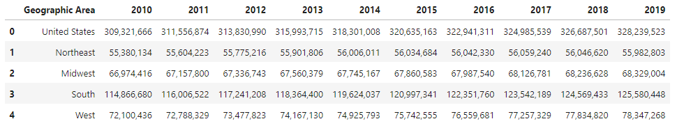
The first column contains the names of geographic regions, while each of the subsequent
columns contains the population counts for a given year. However, you’ll notice that the
DataFrame index is not set. Unless told otherwise,
Highcharts for Python will look for x-axis values in the index.
Secondly, if you were to look under the hood, you’d see that the
DataFrame imported all of the numbers in our CSV as
strings (because of the presence of the comma), which is obviously a bit of a problem. So
let’s fix both of these issues:
df = pandas.read_csv('census-time-series.csv', index_col = 0, thousands = ','))
produces:
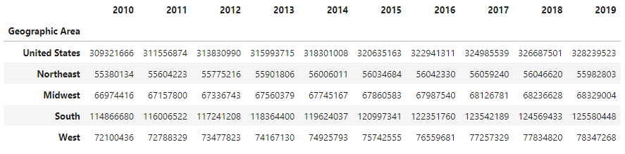
Great! Now, let’s say we wanted to visualize this data in various ways.
Creating the Chart: Chart.from_pandas()
Relying on the Defaults
The simplest way to create a chart from a DataFrame
is to call Chart.from_pandas() like
so:
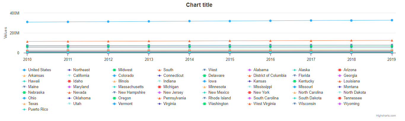
my_chart = Chart.from_pandas(df)
my_chart.display()
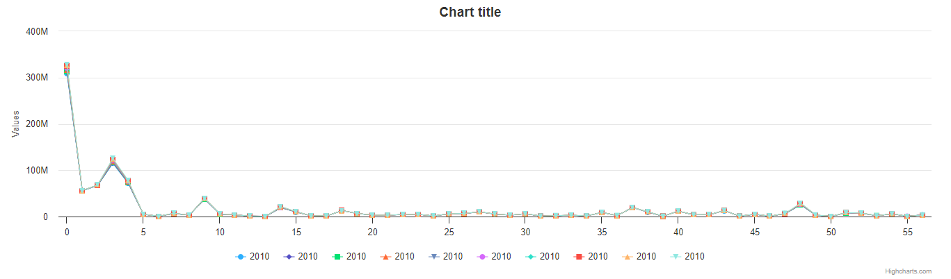
As you can see, we haven’t provided any more instructions besides telling it to
generate a chart from df. The result is a line chart, with one series for each year, and
one point for each region. But because of the structure of our data file, this isn’t a great chart:
all the series are stacked on each other! So let’s fix that.
Tip
Unless instructed otherwise, Highcharts for Python will default to using a line chart.
Setting the Series Type
Why don’t we switch it to a bar chart?
my_chart = Chart.from_pandas(df, series_type = 'bar')
my_chart.display()
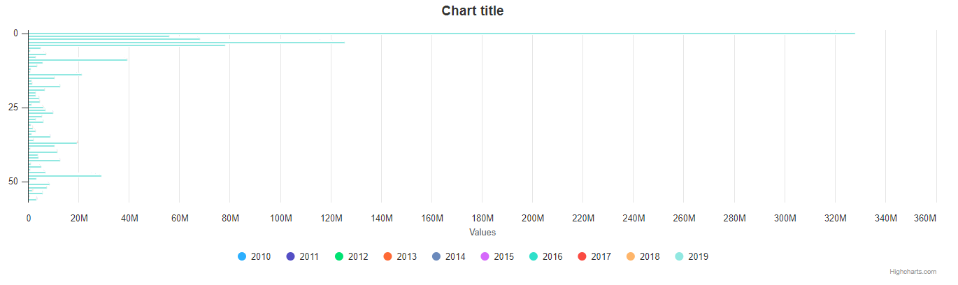
Now the result is a little more readable, but still not great: After all, there are more than fifty geographic regions represented for each year, which makes the chart super crowded. Besides, maybe we’re only interested in a specific year: 2019.
Let’s try focusing our chart.
Basic Property Mapping
my_chart = Chart.from_pandas(df,
                             series_type = 'bar',
                             property_map = {
                                 'x': 'Geographic Area',
                                 'y': '2019'
                             })
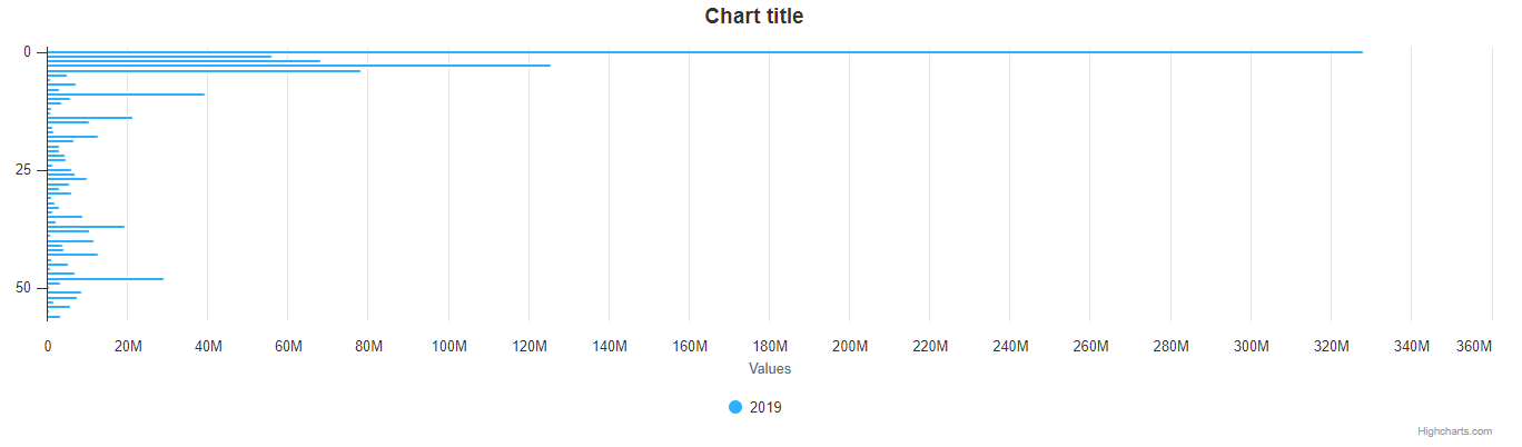
Much better! We’ve now added a property_map argument to the .from_pandas() method call.
This argument tells Highcharts for Python how to map columns in your
DataFrame to properties in the resulting chart. In this case,
the keys 'x' and 'y' tell Highcharts for Python that you want to map the 'Geographic Area'
column to the resulting series’ data points’ .x,
and to map the '2019' column to the .y
properties, respectively.
The net result is that my_chart contains one
BarSeries whose
.data property contains a
BarDataCollection instance populated
with the data from the 'Geographic Area' and '2019' columns in df - and even though
'Geographic Area' is not technically a column, but instead is used as the index,
Highcharts for Python still uses it correctly.
But maybe we actually want to compare a couple different years? Let’s try that.
Property Mapping with Multiple Series
my_chart = Chart.from_pandas(df,
                             series_type = 'column',
                             property_map = {
                                 'x': 'Geographic Area',
                                 'y': ['2017', '2018', '2019']
                             })
my_chart.display()
![Rendering of the chart produced by Chart.from_pandas(df, series_type = 'bar', property_map = {'x': 'Geographic Area', 'y': ['2017', '2018', '2019']})](../_images/census-time-series-06.png)
Now we’re getting somewhere! First, we changed our series type to a ColumnSeries to make it (a little) easier to read. Then we added a list of column names to the 'y' key in the property_map argument. Each of those columns has now produced a separate ColumnSeries instance - but they’re all still sharing the 'Geographic Area' column as their .x value.
Note
You can supply multiple values to any property in the
property_map. The example provided above is equivalent to:my_chart = Chart.from_pandas(df, series_type = 'column', property_map = { 'x': ['Geographic Area', 'Geographic Area', 'Geographic Area'], 'y': ['2017', '2018', '2019'] })The only catch is that the ultimate number of values for each key must match. If there’s only one value, then it will get repeated for all of the others. But if there’s a mismatch, then Highcharts for Python will throw a
HighchartsPandasDeserializationError.
But so far, we’ve only been using the 'x' and 'y' keys in our property_map. What if we wanted to
configure additional properties? Easy!
Configuring Additional Properties
my_chart = Chart.from_pandas(df,
                             series_type = 'column',
                             property_map = {
                                 'x': 'Geographic Area',
                                 'y': ['2017', '2018', '2019'],
                                 'id': 'some other column'
                             })
Now, our data frame is pretty simple does not contain a column named ``’some other column’. But *if* it did, then it would use that column to set the :meth:.id <highcharts_gantt.options.series.data.bar.BarData.id>` property of each data point.
Note
You can supply any property you want to the
property_map. If the property is not supported by the series type you’ve selected, then it will be ignored.
But our chart is still looking a little basic - why don’t we tweak some series configuration options?
Configuring Series Options
my_chart = Chart.from_pandas(df,
                             series_type = 'column',
                             property_map = {
                                 'x': 'Geographic Area',
                                 'y': ['2017', '2018', '2019'],
                             },
                             series_kwargs = {
                                 'point_padding': 5
                             })
my_chart.display()
![Rendering of the chart produced by Chart.from_pandas(df, series_type = 'bar', property_map = {'x': 'Geographic Area', 'y': ['2017', '2018', '2019'], 'id': 'Geographic Area'}, series_kwargs = {'point_padding': 0.5})](../_images/census-time-series-07.png)
As you can see, we supplied a new series_kwargs argument to the .from_pandas() method call. This
argument receives a dict with keys that correspond to properties on the series. In
this case, by supplying 'point_padding' we have set the resulting
ColumnSeries.point_padding property to a
value of 0.5 - leading to a bit more spacing between the bars.
But our chart is still a little basic - why don’t we give it a reasonable title?
Configuring Options
my_chart = Chart.from_pandas(df,
                             series_type = 'column',
                             property_map = {
                                 'x': 'Geographic Area',
                                 'y': ['2017', '2018', '2019'],
                             },
                             series_kwargs = {
                                 'point_padding': 0.5
                             },
                             options_kwargs = {
                                 'title': {
                                     'text': 'This Is My Chart Title'
                                 }
                             })
my_chart.display()
![Rendering of the chart produced by Chart.from_pandas(df, series_type = 'bar', property_map = {'x': 'Geographic Area', 'y': ['2017', '2018', '2019'], 'id': 'Geographic Area'}, series_kwargs = {'point_padding': 0.25}, options_kwargs = {'title': {'text': 'This Is My Chart Title'}})](../_images/census-time-series-08.png)
As you can see, we’ve now given our chart a title. We did this by adding a new options_kwargs argument,
which likewise takes a dict with keys that correspond to properties on the chart’s
HighchartsOptions configuration.`
Now let’s say we wanted our chart to render in an HTML <div> with an id of 'my_target_div -
we can configure that in the same method call.
Configuring Chart Settings
my_chart = Chart.from_pandas(df,
                             series_type = 'bar',
                             property_map = {
                                 'x': 'Geographic Area',
                                 'y': ['2017', '2018', '2019'],
                                 'id': 'Geographic Area'
                             },
                             series_kwargs = {
                                 'point_padding': 0.25
                             },
                             options_kwargs = {
                                 'title': {
                                     'text': 'This Is My Chart Title'
                                 }
                             },
                             chart_kwargs = {
                                 'container': 'my_target_div'
                             })
While you can’t really see the difference here, by adding the chart_kwargs argument to
the method call, we now set the .container property
on my_chart.
But maybe we want to do something a little different - like compare the change in population over time.
Well, we can do that easily by visualizing each row of df rather than each column.`
Visualizing Data in Rows
my_chart = Chart.from_pandas(df,
                             series_type = 'line',
                             series_in_rows = True)
my_chart.display()
Okay, so here we removed some of the other arguments we’d been using to simplify the example. You’ll see we’ve now
added the series_in_rows argument, and set it to True. This tells Highcharts for Python that we expect
to produce one series for every row in df. Because we have not specified a property_map, the series
.name values are populated from the 'Geographic Area'
column, while the data point .x values come from each additional column (e.g. '2010', '2011', '2012', etc.)
Tip
To simplify the code further, any class that supports the
.from_pandas()method also supports the.from_pandas_in_rows()method. The latter method is equivalent to passingseries_in_rows = Trueto.from_pandas().For more information, please see:
But maybe we don’t want all geographic areas shown on the chart - maybe we only want to compare a few.
Filtering Rows
my_chart = Chart.from_pandas(df,
                             series_type = 'line',
                             series_in_rows = True,
                             series_index = slice(7, 10))
What we did here is we added a series_index argument, which tells Highcharts for Python to only
include the series found at that index in the resulting chart. In this case, we supplied a slice
object, which operates just like list_of_series[7:10]. The result only returns those series between index 7 and 10.
Creating Series: .from_pandas() and .from_pandas_in_rows()
All Highcharts for Python series descend from the
SeriesBase class. And they all
therefore support the .from_pandas() class method.
When called on a series class, it produces one or more series from the
DataFrame supplied. The method supports all of the same options
as Chart.from_pandas() except for options_kwargs and
chart_kwargs. This is because the .from_pandas() method on a series class is only responsible for
creating series instances - not the charts.
Creating Series from Columns
So let’s say we wanted to create one series for each of the years in df. We could that like so:
my_series = BarSeries.from_pandas(df)
Unlike when calling Chart.from_pandas(), we
did not have to specify a series_type - that’s because the .from_pandas() class method on a
series class already knows the series type!
In this case, my_series now contains ten separate BarSeries
instances, each corresponding to one of the year columns in df.
But maybe we wanted to create our series from rows instead?
Creating Series from Rows
my_series = LineSeries.from_pandas_in_rows(df)
This will produce one LineSeries
instance for each row in df, ultimately producing a list of
57 LineSeries instances.
Now what if we don’t need all 57, but instead only want the first five?
Filtering Series Created from Rows
my_series = LineSeries.from_pandas_in_rows(df, series_index = slice(0, 5))
This will return the first five series in the list of 57.
Updating an Existing Series: .load_from_pandas()
So far, we’ve only been creating new series and charts. But what if we want to update
the data within an existing series? That’s easy to do using the
.load_from_pandas() method.
Let’s say we take the first series returned in my_series up above, and we want to replace
its data with the data from the 10th series. We can do that by:
my_series[0].load_from_pandas(df, series_in_rows = True, series_index = 9)
The series_in_rows argument tells the method to generate series per row, and then
the series_index argument tells it to only use the 10th series generated.
Caution
While the
.load_from_pandas()method supports the same arguments as.from_pandas(), it expects that the arguments supplied lead to an unambiguous single series. If they are ambiguous - meaning they lead to multiple series generated from theDataFrame- then the method will throw aHighchartsPandasDeserializationError